Two documented moments anchor the form's history: Jan Tschichold, the modernist typographer, standardized Penguin's paperback covers in the late 1940s into the gridded, color-banded design that put serious books in ordinary pockets; and Chip Kidd, across three decades at Alfred A. Knopf, produced covers — the Jurassic Park dinosaur silhouette among the most recognized in publishing — that entered the wider visual culture. The book cover is commercial art with a museum-grade lineage: the AIGA's 50 Books / 50 Covers competition has juried the year's best since the 1920s, making cover design the one corner of publishing exhibited and collected like the graphic design discipline it is.
What is a cover actually doing?
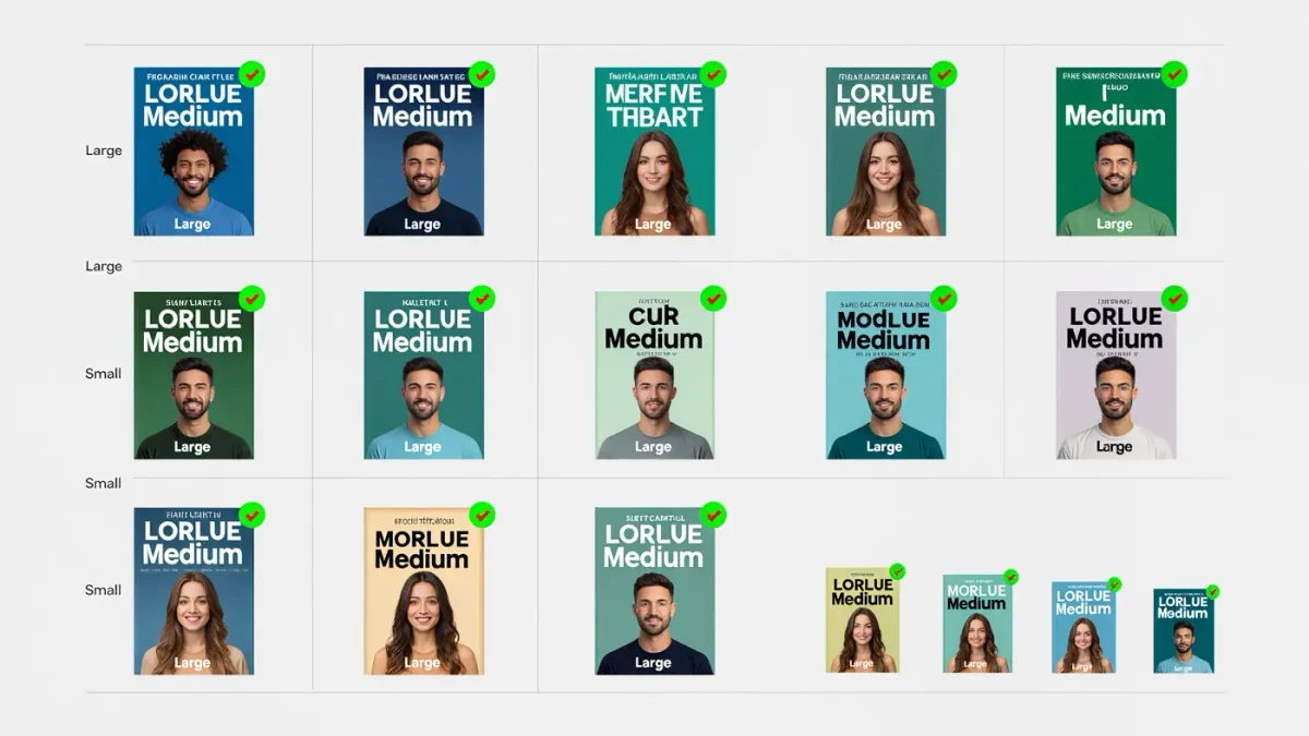
Three jobs in one image: promise a genre, carry a mood, and survive the context where it will actually be seen — increasingly a thumbnail the size of a postage stamp on a retail page. The documented craft response to the thumbnail problem reshaped the field in the 2010s: bolder type, simpler compositions, high-contrast palettes, concepts that read at a glance and reward the second look at full size. A cover that only works large is now a gallery piece; a cover that only works small is a placeholder. The best working designers solve for both scales simultaneously, which is a stricter brief than most posters face.
How does a cover get made?
Through a pipeline most writers meet only at the end. The art department commissions a designer — staff or freelance — who reads or skims the manuscript, receives the marketing positioning and comp titles, and returns concepts in rounds. The editor and marketing weigh in; sales gets asked whether the concept will survive the account pitch; the author is consulted within the limits of the contract's cover approval clause, which in standard trade boilerplate is consultation rather than control — the phrase "the cover is the publisher's advertisement" recurs across designers' and agents' accounts of the diplomacy involved. Covers are chosen by committees under category constraints, which makes the great ones more remarkable, not less.
Why do covers look alike within categories?
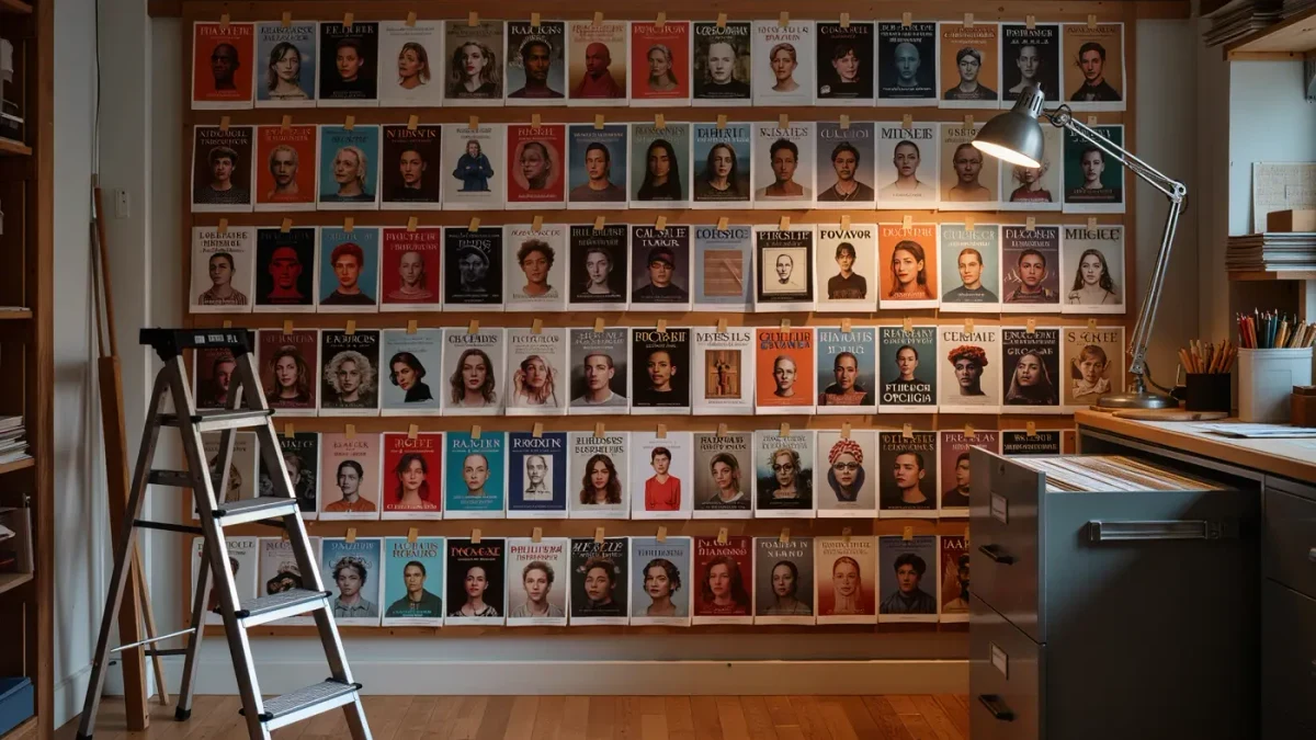
Because covers are signals before they are art. A reader scrolling a category page is pattern-matching — the lonely figure on literary fiction, the script-plus-flourish on historical romance, the bold sans-serif title on business books — and designers work with the pattern to be found, against it to be distinguished. The documented cycle: a breakout cover resets the category's expectations, a hundred imitations follow, and the field clears for the next reset. Trend fatigue is therefore a design problem with a business clock: covers that looked current at acquisition date can look dated at laydown two years later, one reason backlist re-covering has become a documented growth practice in the retail analytics era.
What about the author's name?
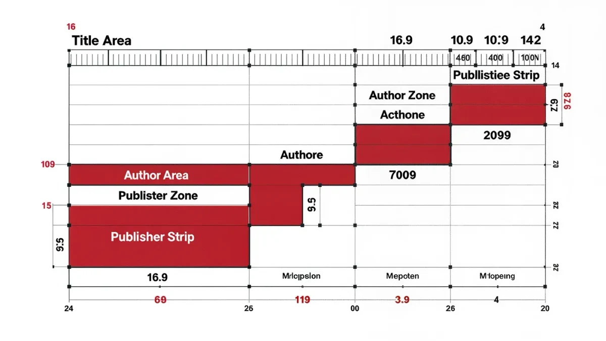
The name is the cover's most expensive element. Bestseller typography — the consistent, protected treatment of a brand-name author across editions — functions as a trademark, planned and defended as such. The documented pecking order on real estate: for debut authors, the concept carries the cover and the name sits modest; with each bestseller, the name grows and the concept shrinks, until the celebrity jacket is mostly typography and a single supporting image. Designers describe this as the cover's inversion: it stops introducing the writer and starts confirming the reader's decision.
Can covers be collected?
Yes, and the market is quietly real. First editions are prized partly for their jackets — the dust jacket being the fragile, discarded-prone element that scarcity punishes — and the design world collects covers as prints, with the AIGA's annual exhibitions and monographs on Kidd, Scher, and the paperback tradition documenting the form's canon. For the writers reading: your cover is the only piece of your book that most people will ever see, made by a specialist in a process you will briefly touch. Treat the consultation seriously, bring objections as reader-reactions rather than art direction, and remember the designer's problem — one image, two scales, a category's history, a committee — the next time a jacket disappoints.
Frequently asked questions
Do authors get approval over covers?
Usually consultation, not approval — standard trade contracts give the publisher the final call while promising the author a look and a listen. Agents negotiate harder cover clauses for authors with leverage, and the working practice is managing the consultation constructively: reactions, not mockups.
Why do so many covers in a genre look similar?
Covers signal category for readers scanning fast; the pattern is the message. Breakout designs reset the pattern and imitations follow — a documented cycle that makes sameness the default and distinction the expensive exception.
What makes a cover work as a thumbnail?
Bold simple geometry, high contrast, and type legible at small sizes — the craft constraints that reshaped cover design with online retail. The surviving skill is designing for the glance and the hold simultaneously.